Redesigning Jenkins (Part Two)

In Part One we discussed the motivation behind redesigning Jenkins, the most used CI/CD platform in the world, and the technical challenges that come with such an effort.
Today, we’ll dive deeper into the design decisions behind some of the new UI features, how we’re improving the developer experience, and what we’re doing to ensure compatibility across the plugin ecosystem without slowing down progress.
Part Two - Lift-off
With Jenkins 2.516.1, we’ve reworked large amounts of the Jenkins user interface - the result of years of dedicated work by the community. This release marks a major milestone in the evolution of Jenkins, with nearly every part of the interface having been refined for clarity and usability. From the navigation and theming to pipeline visualization and customization, the entire experience has been reimagined to better serve both new and old users.
Refined interface
One of the most noticeable changes in Jenkins 2.516.1 is the introduction of the redesigned header. This new header merges the traditional top bar and breadcrumb navigation into a single, streamlined component. The result is a cleaner, more modern interface that not only looks better but also improves usability by saving valuable vertical space - approximately 60 pixels per page.
Beyond its appearance, the new header is fully responsive. Breadcrumbs and actions dynamically adjust to different screen sizes. Additionally, global actions like Manage Jenkins, which were previously only accessible from the dashboard, are now embedded directly into the header, making them accessible from any page.
Redesigning a platform as extensible as Jenkins means every change must be carefully considered for its impact on the plugin ecosystem. Throughout the ongoing redesign, maintaining compatibility with existing plugins has been prioritised. This involved extensive testing, clear deprecation paths, and providing migration guides for plugin authors. The goal is to do as much heavy lifting for plugin developers as possible, so that only small tweaks would be needed by plugins.
Accessibility was a core focus of the redesign. We improved color contrast ratios across the interface, making Jenkins easier to use for everyone, including those with visual impairments. Interactive elements now have more contrast, and we’ve enhanced keyboard navigation throughout the UI.
We’ve also introduced new border variables that developers can use: --jenkins-border and --jenkins-border—subtle.
These borders automatically change size and color depending on context, ensuring that they are always visible and
accessible. When your system is set to increased contrast mode, borders automatically adapt - ensuring components
remain visible and easy to distinguish throughout Jenkins.
Revamped pipeline visualisation
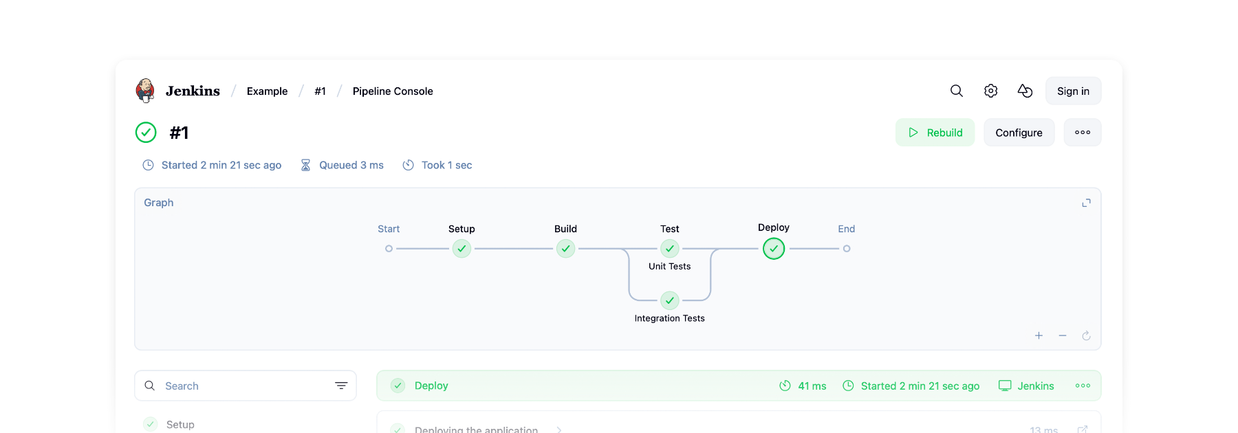
Pipelines are central to how Jenkins automates the process of building, testing, and deploying software. They outline the entire workflow from code commit to production. As these pipelines become more complex, it can be challenging to track progress or identify issues. This is where pipeline visualization becomes essential - turning a series of abstract steps into a clear, interactive flow.
The Pipeline Graph View plugin does just that, displaying each stage of a run in a clean, intuitive graph. It’s designed to help users quickly grasp the structure and status of their pipelines at a glance.
This year, the plugin has been completely rebuilt, and the response from the community has been fantastic. We’ve moved the plugin from Webpack to Rspack and Vite, and replaced class components with functional ones. This cleanup removed thousands of lines of code, improving performance and maintainability.
The new interface, based on the Jenkins Design Library, now supports full-page scrolling, sticky headings, and pan-and-zoom capabilities for the pipeline graph. New animations, loading skeletons, and clear stage progress indicators create a smoother, more responsive user experience.
A unified view brings together the pipeline graph, stage details, and logs into a single layout, so you can now track execution and output in one place. The layout is customizable - the graph can be moved and columns resized or hidden.
Finally, performance has been significantly boosted. The plugin loads faster, scrolls more smoothly, and handles large pipelines more efficiently than ever before.
Want to learn more about Pipeline Graph View? Read our previous article.
New ways to customize Jenkins
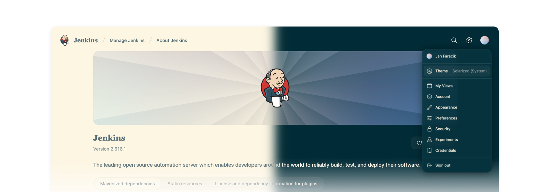
Jenkins 2.516.1 is the most customizable version of Jenkins yet. There’s more themes than ever before, and a whole new way of changing themes on the fly. Just hover over your user account icon to get access to the new theme picker.
Make Jenkins your own with a variety of themes:
-
Dark theme - A sleek, modern look that’s easy on the eyes.
-
Solarized theme - Ethan Schoonover’s beloved, balanced theme returns with a fresh release for Jenkins.
-
Catppuccin theme - A soothing pastel theme for Jenkins.
-
Chocolate theme - Indulge your Jenkins in rich, dark tones with golden highlights for a refined and elegant developer experience.
-
Nord theme - A clear, uncluttered, and elegant design to achieve undisturbed focus and excellent readability.
Want to create your own theme? We’ve made it simple with a brand-new Maven archetype – check it out.
On top of that, there’s the Customizable Header Plugin. This lets you fully customize the new header - change the logo, links, or actions to tailor Jenkins to your organization’s workflow and brand.
Evolving the developer experience


Jenkins is powered by hundreds of contributors, but working with its proprietary technologies – particularly Jelly and Stapler – can be a challenge for newcomers.
Jenkins Design Library
At the end of last year, Jenkins Design Library 3 was introduced - a major step forward in modernizing the Jenkins UI and improving the development experience. Jenkins Design Library is a comprehensive system of reusable UI components, layout patterns, and style guidelines tailored specifically for Jenkins. It standardizes how interfaces are built, ensuring consistency across plugins and core features while aligning with modern web practices and accessibility standards.
For contributors, this means a more efficient and reliable way to build user interfaces. Instead of creating components from scratch or reverse-engineering existing ones, contributors can rely on a shared set of well-documented, pre-tested elements. This not only speeds up development and reduces bugs, but also makes it easier for new contributors to get started and follow established UI conventions.
Plugin for IntelliJ
To help lower the barrier to entry, the Jenkins community offers an IntelliJ IDEA plugin. The plugin streamlines Jenkins development in various ways, such as offering autocompletion and inline documentation for Jelly tags, as well as autocomplete for Jenkins Symbols.
Get involved
Jenkins has come a long way in the last few years, and we’re incredibly excited for what the future holds.
If you want to get involved in the UI and UX discussions of Jenkins join the User Experience SIG.
Take advantage of new components and patterns in your plugin via the Design Library.
About the author